You've heard of the phrase, 'less is more', right? The one that celebrates clear consistent designs and prevents one from going overboard? Well, by the looks of things, this is a concept the designer of this Missouri county logo clearly ignored –and the result is quite incredible.
Don't get us wrong, we get developing a logo that really captures the essence of your brand is no easy feat, but we're pretty sure the answer is not to throw everything on there in such a haphazard way such as this. The longer you look at the design, the worse it gets with its lacklustre cropping of each item, the childish font and the uncomfortably off-kilter position of the eagle.
If you're designing a logo at the minute, this is a great example of what not to do, but if you were looking for some pointers to make your logo the best it can be, then be sure you check out our 15 golden rules of logo design.
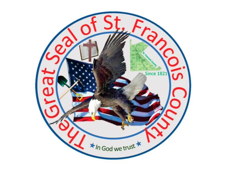
The, frankly, awful logo design was actually created a while ago now, but has been doing the rounds on the internet recently and has caused quite the stir (again) among the graphic design community. So much so, in fact, that the designer and head commissioner of St Francois county, Harold Gallaher, made a statement about it. Explaining the county seal hadn't been updated for a while, Gallaher said: "with some simple software, I brought up this new one, and we've adopted that now as our county seal".
The logo was shared to the Reddit forum r/Crappydesign and hilarious comments have been flooding in for days. One Redditor responded to the design, "In Clip Art We Trust," and another user replied, "Those are some remarkable Photoshop skills for 1821". Someone controversially said, "I actually like it. Sorry. It looks cool and spontaneous".
the_official_county_seal_of_st_francis_county from r/CrappyDesign
the_official_county_seal_of_st_francis_county from r/CrappyDesign
the_official_county_seal_of_st_francis_county from r/CrappyDesign
Following the backlash, St Francois has announced that there will now be a contest to redesign the logo for anyone to get involved with. The exact details are yet to be announced, however, Gallaher has explained that, “We are the Parkland and I would like for the seal to include some symbol about parks," and that he “would like the seal to not have much red colour”. Gallaher wraps up the outlines of the contest by saying, "I would like it to be better than the seal we have now, which would be a slam dunk" – this part we're sure won't be hard.
While we think the design is obviously terrible, we're also kind of in awe at Gallaher having a go and giving his own work the green light, particularly when design is clearly not his strong point. Maybe he should have started with one of the best free logo designers?
Read More:
You may be interested in:
>> Is a Chromebook worth replacing a Windows laptop?
>> Find out in detail the outstanding features of Google Pixel 4a
>> Top 7 best earbuds you should not miss
Related Posts:
>> Recognizing 12 Basic Body Shapes To Choose Better Clothes
>>Ranking the 10 most used smart technology devices
>> Top 5+ Best E-readers: Compact & Convenient Pen

0 Comments:
Post a Comment